10 Dec 2010

Child Abuse Adverts

I looked at different child abuse posters from google for my research to make a child abuse advert.


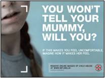
All of the posters I looked at had emotive images to make the audience feel sympathy for the children. The image is quite dull because it's not a nice subject. The first one I looked at had text on it, the main text 'you won't tell your mummy, will you?' is as if the person looking after her has done something wrong and makes you feel sorry for the girl in the image. This is to connect with the audience. The text underneath 'if this makes you feel uncomfortable imagine how it makes her feel' trying to make you put yourself in her shoes and help.

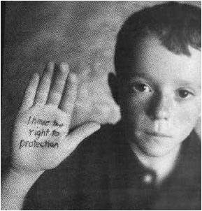
The next image uses a young boy for the image, the image is in black and white as if his life is in black and white because of child abuse. He's looking straight towards the camera to connect with the audience. The text in this image is different because it's on his hand as if he is saying it and asking you for protection.


In the next picture they use shadows to represent someone standing over them. Shadows are used a lot to show following and are associated with being quite scary the shadows in these two images show abuse. Shadows also imply they hide away. The reaction from the child looking scared show abuse as well.


video editing

http://www.youtube.com/watch?v=Ke5UpKiVXmk
http://www.youtube.com/watch?v=f9MALugh-r4

These are the links to my practise film work. We had 2 tasks one was to just using film (Lorna Inglis AS media doors). Our brief was to use editing to make a film using doors and different angles. We then had to edit the clips all together. I worked in a group of 4 with 2 cameras. In our group we decided on 2 locations to film so we had one door leading to a different place to break things up a bit and see what we could do with it in the editing process. We used adobe premiere pro. We used a range of shots such as close-up, low angles, zooms, pan upwards etc.
In the other film we had to then edit audio and film (Lorna Inglis media conversation) for this we we told to use shots of each person talking and edit them so they flowed for this piece we only used 1 camera.

26 Nov 2010

Camera Angles


Long shot


This shot shows everything almost ‘life’ size and will show the entire human body head to toe. But also ou will see the detail in the background. Or and extreme long shot would be to establish setting rather than characters in the setting.


Medium shot

This shot shows about half of someone from about the waist up and is used for dialogue scenes mainly or to show details of an action. There is less background detail as the focus would be on the character.

Close- up

This shot concentrates on a specific character or detail or misé en scene and will have a blured background. This shot magnifies the subject and focusses on the important things. The extreme close-up would magnify even more and be just an eye or a very small detail.


Birds-eye view


This is a shot from directly above, it can put the audience in a 'god-like' position looking down on things and making them look almost insignificant. It can also establish setting.


High angle


This is a shot where the camera is high. It can make people look shorter and less significant almost like a less extreme version of birds-eye view. Everything becomes part of a wider picture.


Establishing Shot


This shot established setting and/or character. IT establishes the surrounding and sets the scene.


Low angle

This is a shot where the camera is lower than the subject looking up on it. Can make shorter people look bigger and make them look more important and almost scary. It makes the audience look up to the subject or be intimidated by it.


3 Nov 2010

Preliminary Task

This is my sixth form magazine I did a Front cover and a double page spread for my audience of students age 15-18 and thinking of joining a sixth form.
I choose the font because its clear but stylish to appeal to young people i choose to do a kind of shadow text to make it more appealing. i did a bit of text down the side to give a taster to the magazine i have seen this on other magazines i have reasearched.
i put a blue background to appeal to most genders, i tryed other colours like purple and green but i decided they leaned more towards one gender. Blue is a colour that is almost neutral between genders.
I took this picture of 2 sixth form students being smiley and happy to encourage people to come to sixth form because it's a happy environment. I did one main image like on other teen magazines i looked at. I feathered some smaller images in at the bottom of people working to have a quick glance of what is inside the magazine and also to have the students at work. I feathered it to make it more attractive to the younger audience.

For the double page spread i choose the same font and same shadowing on text to have a 'house style'. The green background is quite neutral and the green and purple text contrasts to stand out from the other black and white text to seperate the subjects.

I did a school based agony aunt with a mad professor. The 'fun facts' are funny and some celebrity based to appeal to the audience. This section of the magazine also allows audience interation.



8 Oct 2010

TEEN MAGAZINES

I have looked at front covers of teen magazines to gather some ideas for my sixth form magazine.
Most of these magazines have big, bold main pictures mostly people. and bright, eye-catching colours.